Currently booking projects for July & beyond – INQUIRE NOW


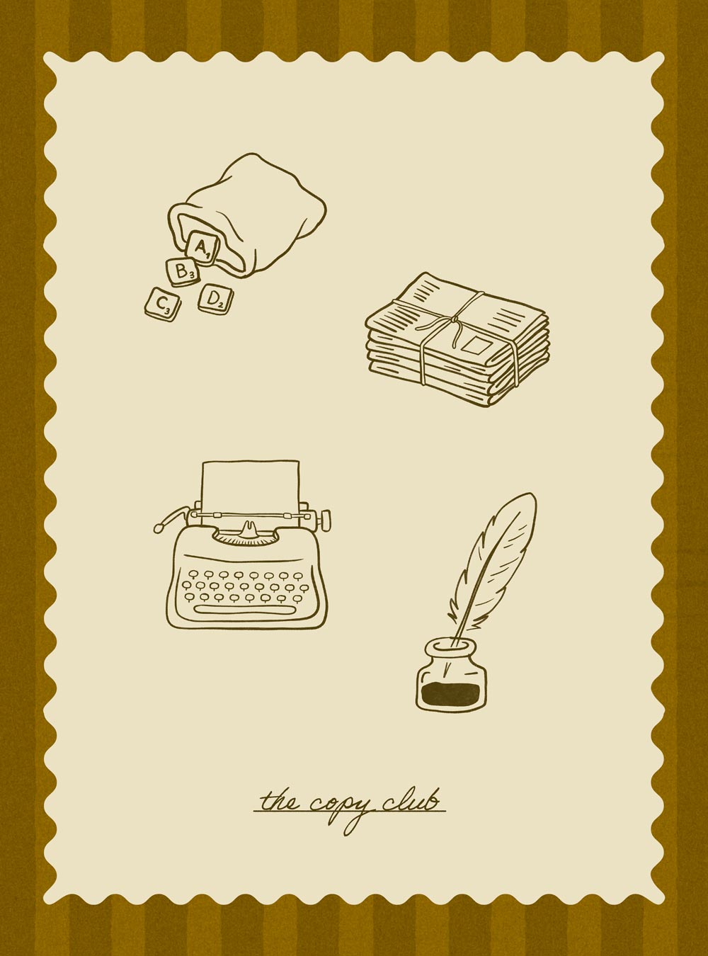
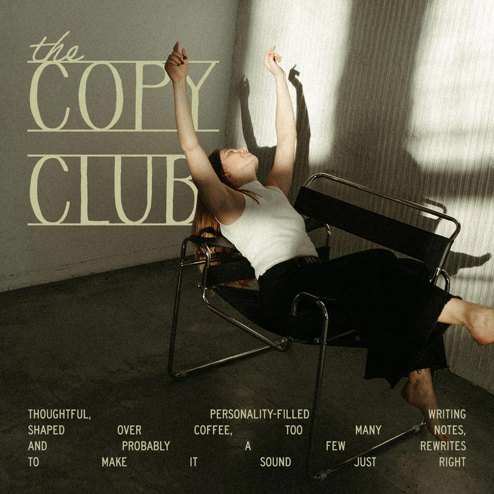
Hannah is a UK-based copywriter who believes words should have personality. Her brand, The Copy Club, is built around storytelling, writing that feels human, warm and full of character. When she came to me, she had a feeling for what she wanted but couldn't quite put it into words. Through the strategy process, asking the right questions and listening carefully, something started to emerge, books, vintage games, the smell of old paper, Sunday afternoons at her grandparents' cottage playing Scrabble. Those memories weren't just personal details. They were the whole brand. My job was to ask the questions that helped her find that, and then translate it into something visual.
The identity draws from Hannah's world almost literally. A palette inspired by aged paper and ink. Striped patterns and playful compositions that reference games and language. Hand-drawn illustrations rooted in vintage objects and childhood memories. Typography that balances editorial elegance with warmth and approachability. Nothing was chosen arbitrarily. Every detail points back to who Hannah is and what she loves. The result is a brand so specific it could only ever be hers. And that specificity does something powerful. Her potential clients now know exactly who she is and what working with her feels like before they've even said hello.


This website uses analytics cookies to understand how visitors interact with the site and to improve the overall experience.

