Currently booking projects for July & beyond – INQUIRE NOW


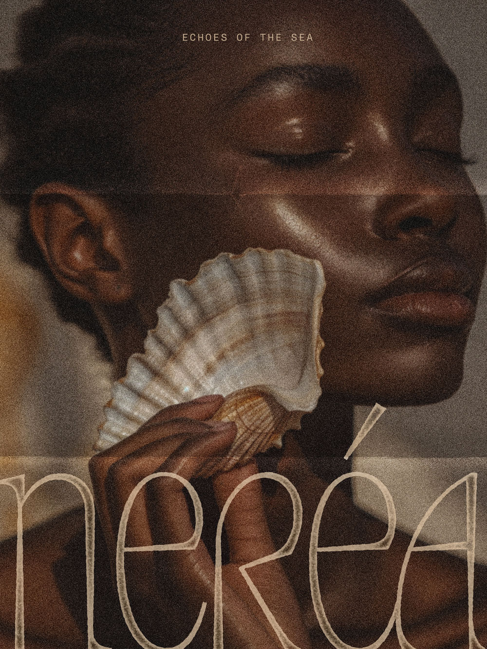
Nerea was created at the very beginning of its journey, with the intention of building a cosmetic brand that felt authentic, established, and deeply rooted in storytelling. Created in the Basque Country and inspired by the quiet power of the sea, the mission was to craft a brand that feels like an experience — immersive, poetic, and timeless. Drawing from ancient rituals and marine botanicals, the identity was designed to honour the sea as a source of care, wisdom, and renewal, while inviting a sense of calm, depth, and quiet strength.
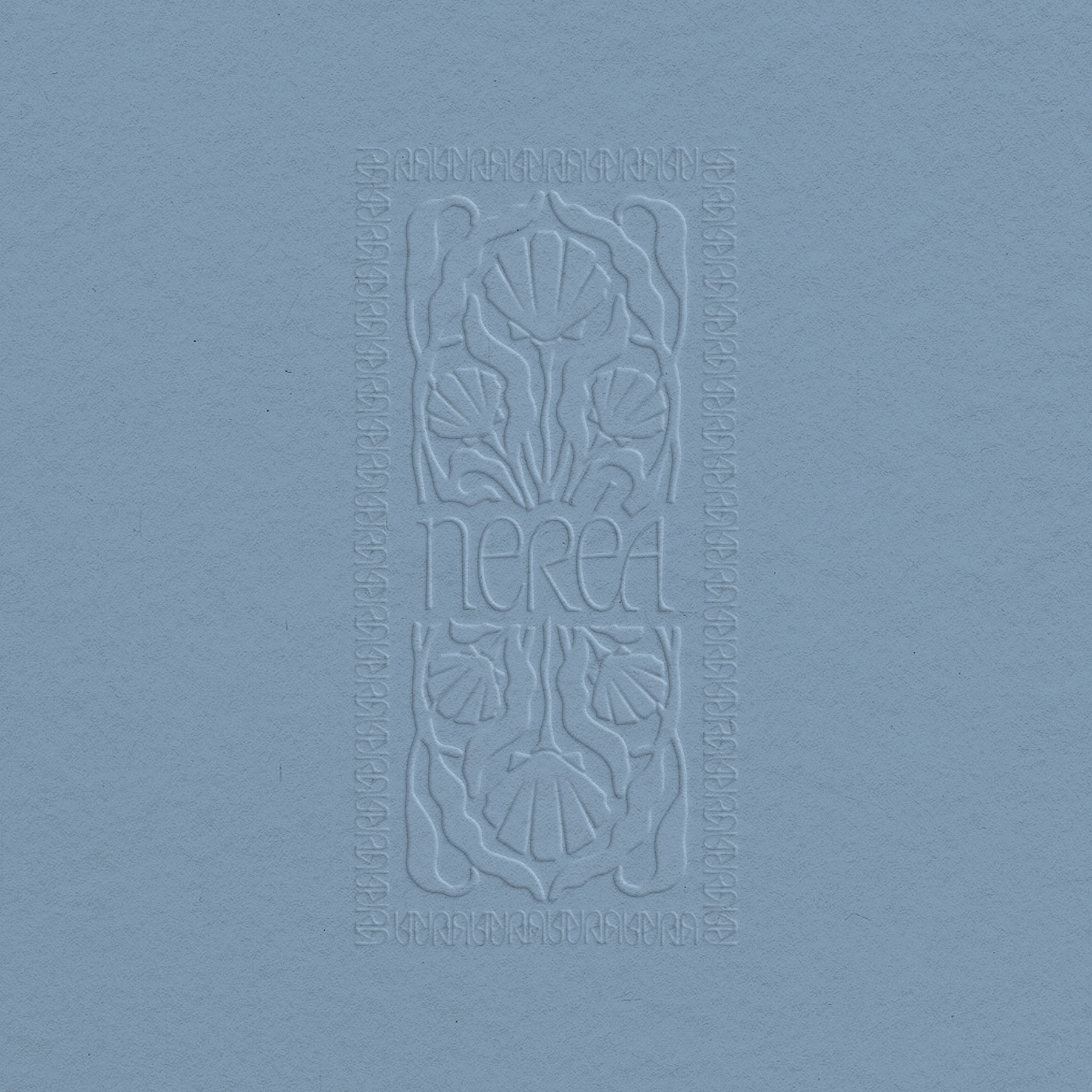
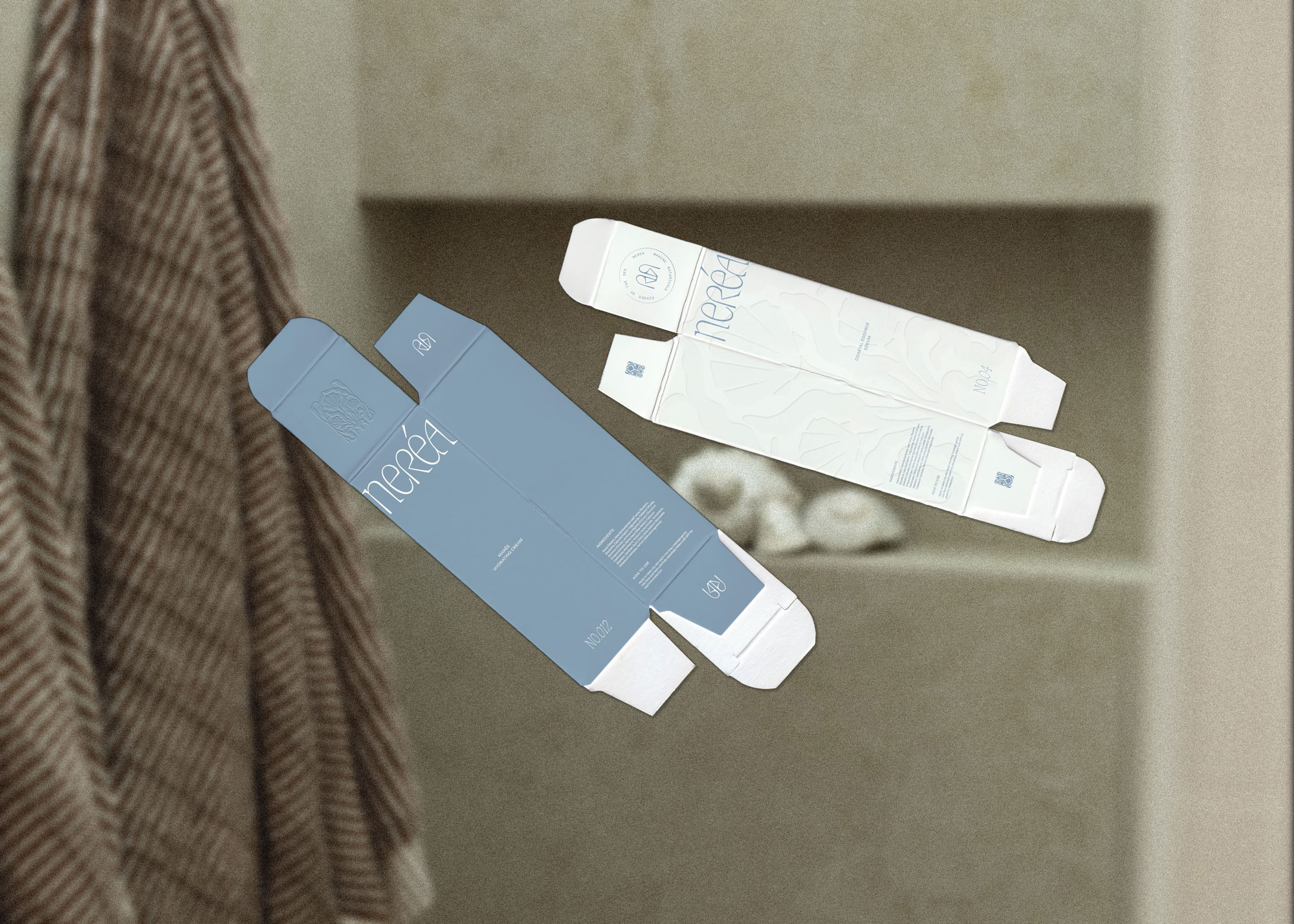
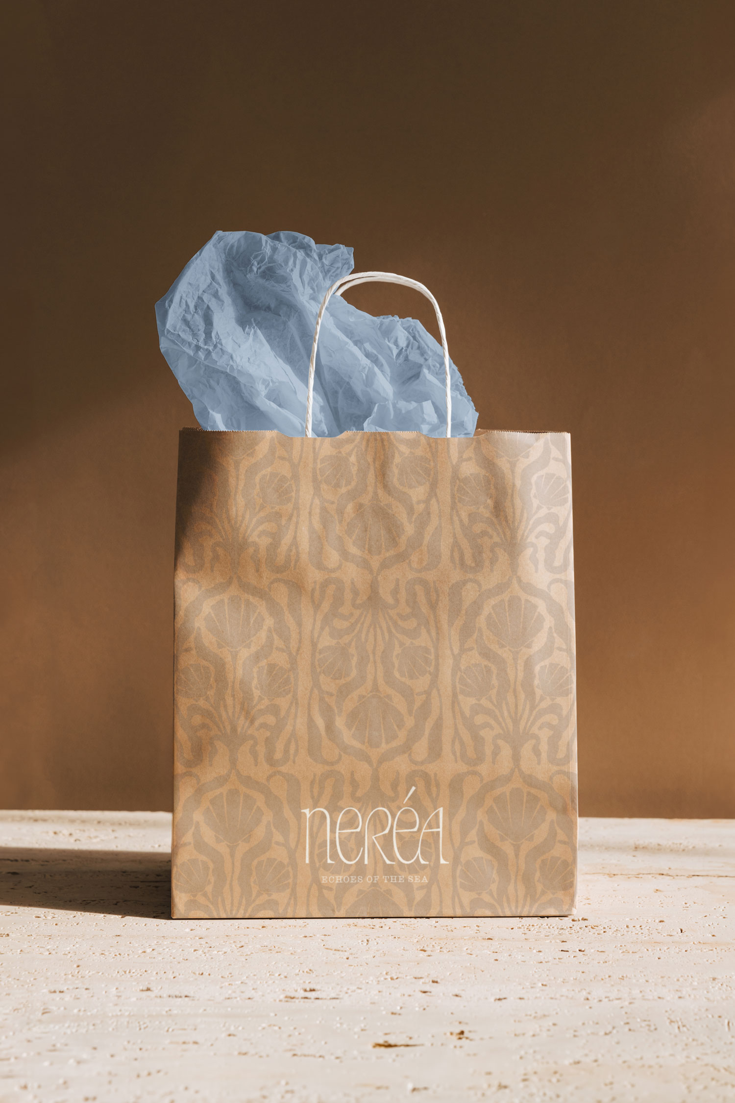
The identity blends strategy with artistry to create a brand that feels both grounded and evocative. A timeless serif typeface with subtle custom letter adjustments establishes elegance and longevity, while a soft, greyed blue drawn from the depths of the sea is balanced with shell-like off-whites and muted sandy tones. Hand-drawn illustrations form a symmetrical bouquet of seaweed and shells, inspired by antique floral motifs and Art Nouveau aesthetics. The custom icon — shaped from the interplay of the “n” and “r” — subtly evokes a Greek vase or serum vessel, reinforcing the idea of a mythical fountain of youth. Together with minimal yet expressive packaging and artful, print-inspired details reminiscent of traditional stamping techniques, the brand unfolds as a sensory, immersive experience — quietly powerful, poetic, and enduring.


This website uses analytics cookies to understand how visitors interact with the site and to improve the overall experience.

